- part 1: An introduction to this project and links to the github repository.
- part 2: A list of subtasks involved with this project.
- part 3: The experimental setup, dataset, and definition of input tensors and targets.
- part 4: How I built and trained the model. ConvLSTM cell math details and diagram.
If you’ve been following this set of posts, I’m pleased to say we’ve reached the end—thanks very much for reading! The final result of this experiment was very shocking to me. An M. Night Shyamalan-esque plot-twist ending to this story. In this post, I’m going to give the main result upfront and then spend some time unpacking the nuances of self-supervised problems that it exposes. Hopefully, it will help you avoid making similar mistakes.
The model does equally well as the baseline!—with a caveat
Note: For all results in this post I used the best-performing model, called “upbeat-snowflake-91” (teal curve in the figures W, P). This model only has a single ConvLSTM and dense layer, rather than two stacked ConvLSTM layers.
Comparing ROC curves demonstrates that the baseline model, which takes \(\tilde{y}\) as input, just barely outperforms my best version of the ConvLSTM-based model (“upbeat-snowflake-91”). The reasons for this are not obvious, but I will explain later in this post. For example, it is not necessarily due to the model lacking optimized hyperparameters or architecture. Although, that is possible. I believe it has more to do with the way the task was set up/the way the data was labeled.
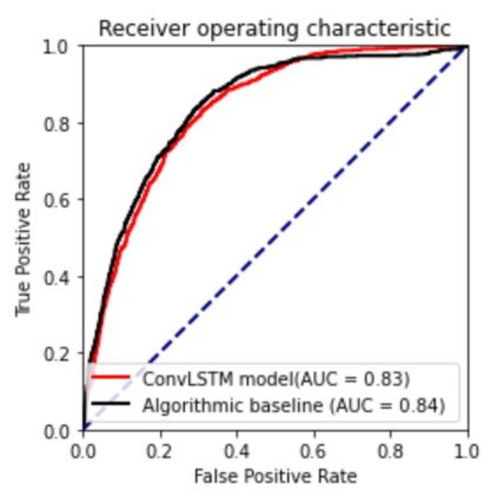
Fig. ROC curve for the ConvLSTM model and algorithmic baseline. Higher ROC area under the curve (AUC) generally implies better performance on the dataset. The blue line indicates the ROC curve for a model that outputs totally random probabilities (AUC=0.5). These curves show the relationship between the false positive and true positive rate as you increase the probability threshold \(r\) used to divide predictions into binary classes. The testing dataset was used to compute both curves.
Below are several metrics to compare the two models. All metrics are derived from the testing dataset. \(r_{acc}\) and \(r_J\) are the probability thresholds that maximize accuracy and Youden’s statistic respectively. These thresholds are used to convert outputted probabilities \(\hat{y}\) to binary classes. All probabilities greater/less than \(r\) are set to 1/0 (positive/negative).
In the bottom two rows, I list two rates per column. The first number represents the rate when using \(r_{acc}\) , and the second number is the rate when using \(r_J\). Due to heavy class imbalance in my dataset (86% negative samples), maximizing accuracy prioritizes having a low false positive rate. However, the true positive rate then becomes unacceptably small. Using Youden’s index attempts to find a good balance between FPR and TPR.
I found that hand-tuning the probability threshold to a value in-between \(r_{acc}\) and \(r_J\) gave the visually best result. For the ConvLSTM model, I used \(r=0.6\) in the Figs. GX and Y_hat.
| Metric | ConvLSTM Model | Algorithmic Baseline model |
|---|---|---|
| ROC-AUC | 0.83 | 0.84 |
| Max accuracy, \(r_{acc}\) | 0.847, 0.80 | 0.854, 0.98 |
| Max Youden’s J, \(r_J\) | 0.519, 0.31 | 0.543, 0.60 |
| True positive rate: with max Acc, with max J | 0.099, 0.829 | 0.199, 0.831 |
| False positive rate: with max Acc, with max J | 0.013, 0.310 | 0.024, 0.289 |
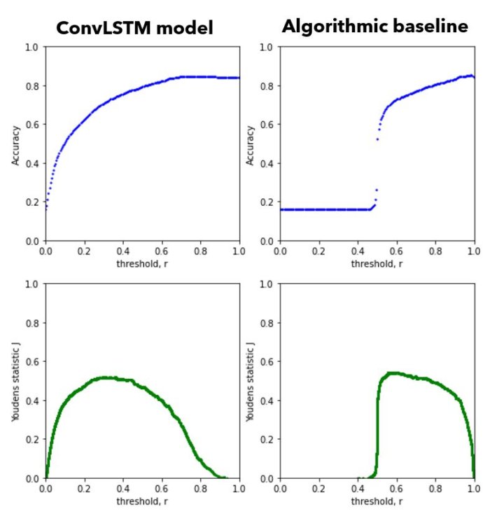
Fig. Accuracy (top row) and Youden’s statistic \(J\) (bottom row) as a function of the probability threshold \(r\).
Training behavior - the effect of model size
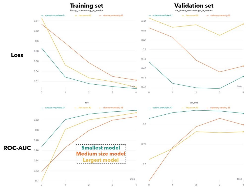
Fig.W Training curves over 5 epochs for the binary crossentropy loss and AUC, on training and validation sets.
The best three models had training behavior that one would expect. Each was trained for 5 epochs (taking 27 hours on average). Typically the loss on the training and validation set falls asymptotically. And at a certain point, the validation loss stops decreasing and may even begin to increase. This signals that the model is starting to overfit on the training set. Keras allows you to automatically save the model with the best validation performance (using tf.keras.callbacks.ModelCheckpoint).
All three models had very similar architecture, but differed in the number and/or size of layers. I was surprised to find that smaller models had better performance on both the training and validation sets. The largest model (yellow) had two stacked ConvLSTM layers, twice the number of convolutional filters in each, and three dense layers at the end. The smallest model (teal) had only a single ConvLSTM layer and dense layer (see part 4 for full architecture). In general I found that smaller training sets and larger models tended to overfit faster, which makes sense. The regularizing effect provided by my data augmentation scheme appeared to be essential to getting decent performance.
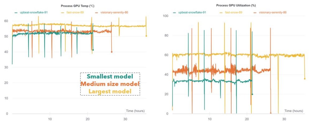
Fig.P GPU temperature and Utilization over time. Both reflect the differences in model size.
\(\hat{y}\) Distributions
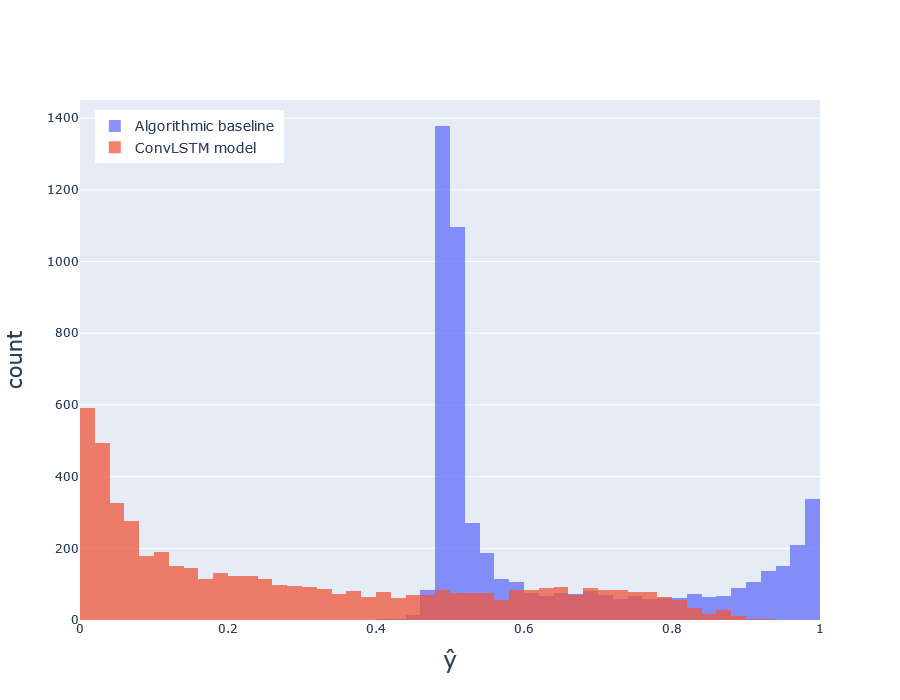 Fig.H Distribution of predicted probabilities \(\hat{y}\) for deep model (red) and baseline (blue), over the test set.
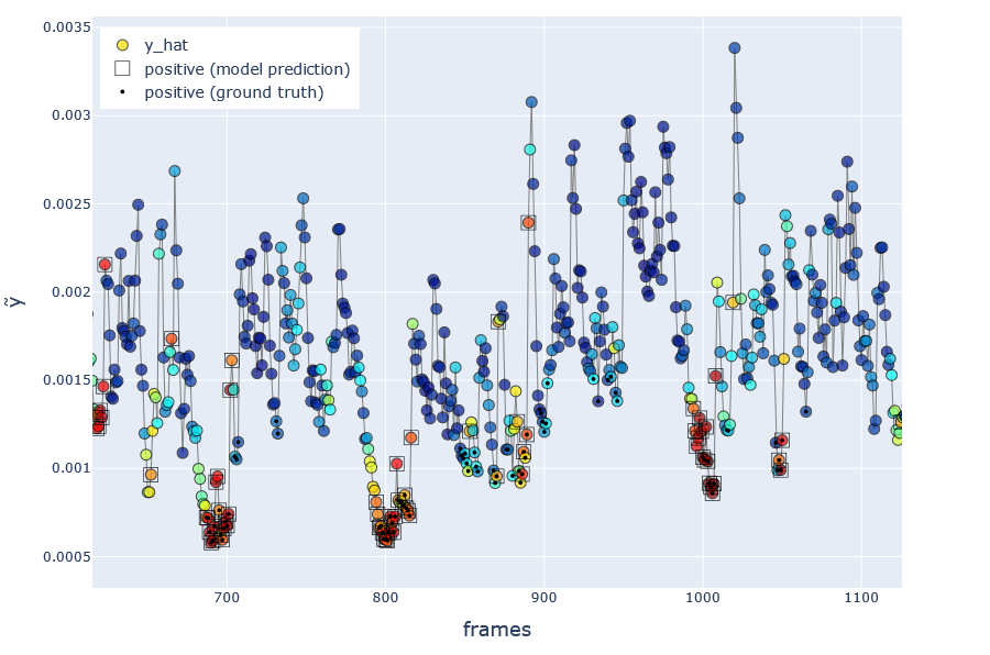 Fig.GX Visualization of model’s predicted probabilities \(\hat{y}\), over a cherry-picked region illustrating large speed spikes. Red/blue indicates higher/lower \(\hat{y}\). Frames with a circled dot represent positive ground truth \(y_i=1\), and without dot represents negative \(y_i=0\). Squares indicate frames classified as positive by the model when using a probability threshold \(r=0.6\).
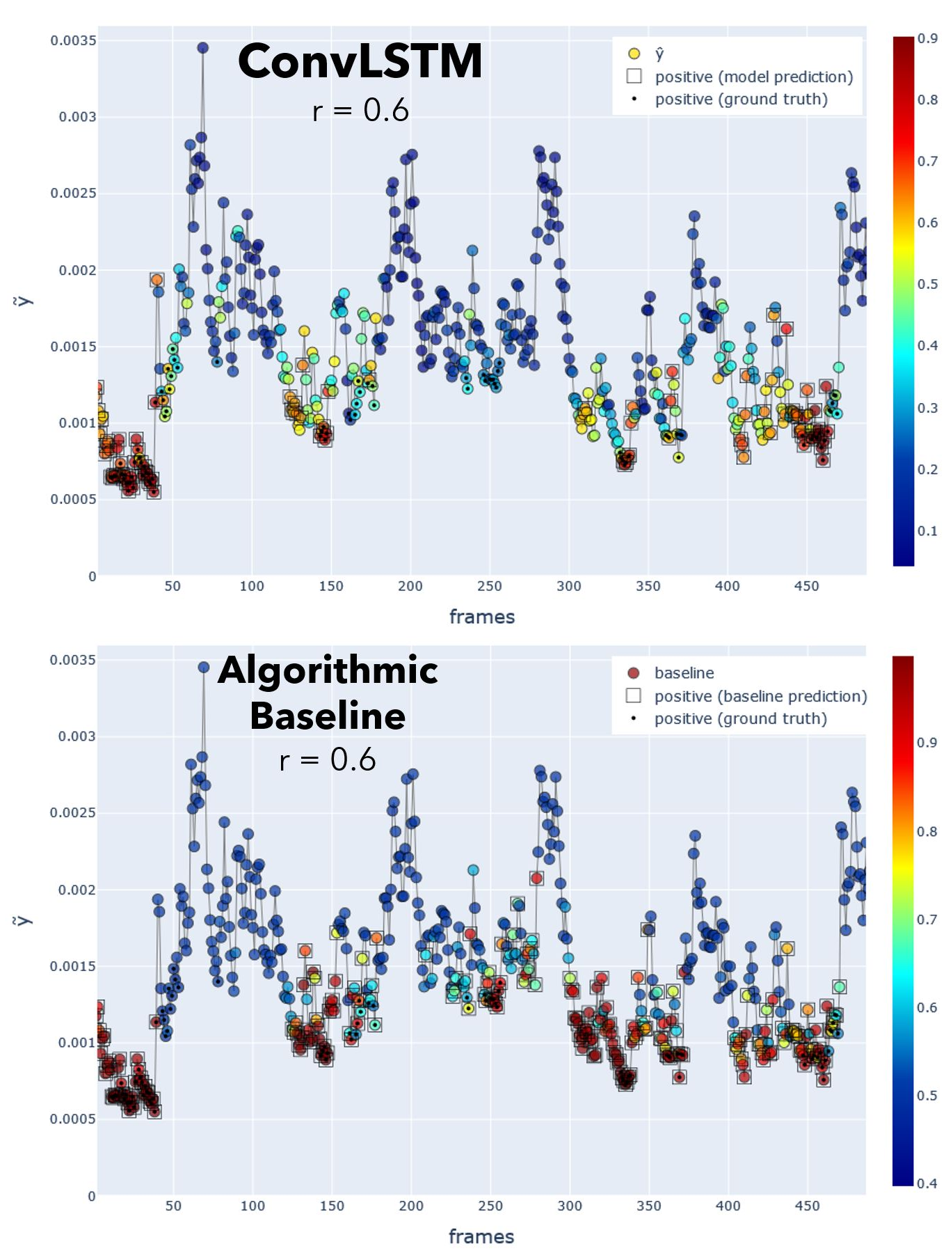 Fig.Y_hat Comparison between deep model and baseline predicted probabilities \(\hat{y}\), for the first 500 frames. Red/blue indicates higher/lower \(\hat{y}\). Frames with a circled dot are ground truth \(y_i=1\). Squares indicate frames classified as positive by the model when using a probability threshold \(r=0.6\). I used \(r=0.6\) for both models purely coincidentally, not intentionally. The baseline threshold was left at \(r=0.6\) because this maximized Youden’s index.
Why does the baseline do just as well as the deep model?

- A) It has two unfair advantages over the deep neural net and
- B) The nature of the data and simple labeling method created a task that was easy to solve with simpler means.
I’m going to go over reason B first.
TLDR; I falsely assumed that the task would be too difficult to solve by applying a simple function—even if that function used knowledge of the labeling algorithm. My real “mistake” was not in optimizing a deep neural net to perform a task; it was in designing a task that truly required a deep neural net.
The labeling function created an easy task
If a simple function was used to label your data, there may exist a simple function that can predict those labels.
(As a side note, I would consider much of the labeling performed by human brains as NOT “simple,” since it’s often non-trivial to approximate with math functions of few parameters. That’s kind of the whole reason we use deep learning.)
After training, we expect the ConvLSTM-based model to output higher probabilities \(\hat{y}\) at frames that come right before a “burst” of motion (corresponding to one or more aggressive interactions). When I first inspected the \(\tilde{y}\) data, I immediately realized the difficulty of defining when a burst begins and ends. Due to chaotic nature of this timeseries, a burst does not have really have any well-defined boundaries. I believe it makes more sense as pattern that our human mind imposes on what we’re observing.
Nonetheless, I had to create some rule that could be used to decide whether the current frame \(i\) precedes a burst (1) or does not (0). The rule is ultimately based on statistical features of \(\tilde{y}\) in a 1.5s window: \([i, i+45]\) (see the function called compute_targets see part 3). Essentially if \(\tilde{y_i}\) is low, relative to the values in the 1.5s window, and if the range of those values is above some threshold, I labeled the frame as \(y_i = 1\).
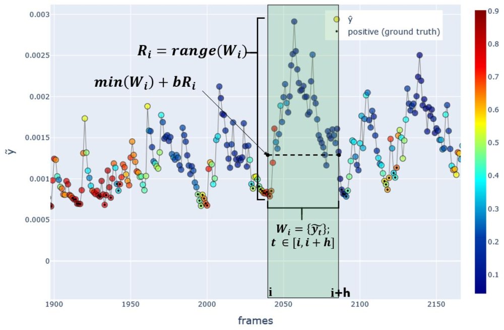 Fig.H Method for labeling each frame. Here the frame \(i\) is being labeled as \(y_i=1\) since it precedes a sudden rise in the speed proxy \(\tilde{y}\). Color indicates the model predictions \(\hat{y}\). Frames with a circled dot represent positive ground truth \(y_i=1\), and without dot represents negative \(y_i=0\).
The baseline model uses a simple rule (not machine learning) that is practically identical to the rule used to label the data in the labeling function compute_targets see part 3). The difference is that the labeling algorithm has access to the time window \([i, i+45]\), while the baseline model baseline_prediction_probabilistic has access to the window \([i-89, i-1]\). Evidently, the \(\tilde{y}\) statistics in the window preceding frame \(i\) carry useful information on the \(\tilde{y}\)’s future trajectory. The baseline model could exploit this to great effect.
In summary, a very simple function was used to label each frame. This is part of the reason why the baseline can do so well. The labeling algorithm uses speed statistics across the time window \([i, i+45]\), while the baseline model makes predictions using the same statistics computed over the window \([i-89, i-1]\).
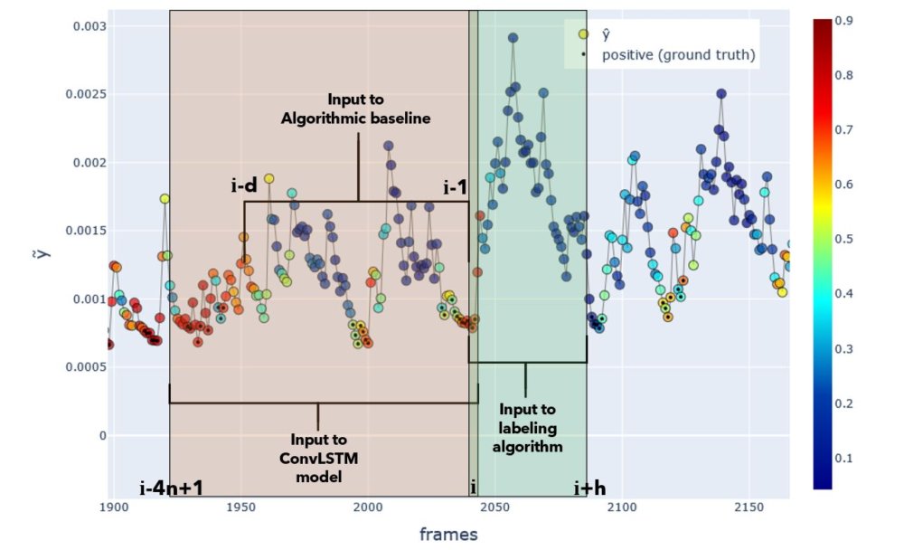 Fig.Input windows. Input windows to each model or algorithm. Actual window sizes used in experiments are shown. Positive ground truth labels are shown as black dots, and the ConvLSTM-based model’s predicted probability is colorized. Y-axis indicates \(\tilde{y}\).
The baseline had unfair advantages that may not be obtainable in most problems
The baseline model leveraged both
- the dataset that was used by the labeling algorithm (namely, \(\tilde{y}\))
- knowledge of how the labeling algorithm works
In the table below, it is clear that the deep model had access to neither of these—only raw video frames and binary labels. I also compared with a regular LSTM, which would take \(\tilde{y}\) as input but not have knowledge of the labeling algorithm.
| Function | used for | has access to dataset used in gt labeling | input | has access to function used for gt labeling |
|---|---|---|---|---|
| Labeling algorithm | labeling each frame as 0/1 | yes, by default | \(\tilde{y_t}\) in window after frame \(i\) | yes, by default |
| ConvLSTM model | predicting frame labels | no | image sequence in window before frame \(i\) | no |
| LSTM model | predicting frame labels | yes | \(\tilde{y_t}\) in window before frame \(i\) | no |
| Algorithmic baseline | predicting frame labels | yes | \(\tilde{y_t}\) in window before frame \(i\) | yes |
Why even use a more complicated model?
In supervised settings, you don’t have access to the labeling function
If the data was labeled by humans, a handcrafted, baseline algorithmic model would not be able to leverage knowledge of how these labels were derived. (In the sense that the classification was ultimately made in someone’s brain.) My baseline was designed to mirror the statistics used by the labeling function.
In self-supervised settings, creating an algorithmic model is rarely trivial
In other self-supervised problems, it is not always trivial to handcraft an algorithmic baseline. For example, if you were training an LSTM to predict the next word in a sentence, this can be considered a self-supervised setting because you are deriving the desired output from the data itself. You would design a training set where last word in the sequence is provided as the output and all preceding words are given to the LSTM as input. In this case, it is not clear how you could use heuristics or simple functions to create a baseline model (one that doesn’t involve some form of machine learning).
In computer vision, image in-painting, image colorization, and super-resolution/supersampling can also be considered self-supervised. In these cases it is even less clear you would come up with hand-crafted baseline that could complete the task.
Conclusion and take-home messages
- The ConvLSTM-based model was able to learn an unknown labelling function, given only video frames and binary labels. Given the high complexity of fish movements, this makes it a promising candidate for modeling spatio-temporal dynamics in other systems.
- I didn’t investigate what features the model learned to detect, but its internal representations would likely be useful in other applications. There are many ways the model could be used in an unsupervised setting for pattern detection. For e.g. identifying “behavioral modes” of a group of humans or animals.
- The model’s ability to learn was very sensitive to changes in data augmentation and hyperparameters. It’s worth it to try different settings, but always start with smaller/simpler models.
- Engineering a good data input pipeline is a crucial step. The format of the training data can have a large impact on the model’s ability to learn.
- Think carefully about whether the problem you’re facing actually requires more complex tools like deep learning!
- If you are designing a self-supervised task, make sure that intelligent labels are created. If they are easy to estimate with simple rules, the model may end up having questionable utility in real-world applications.